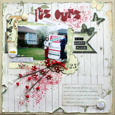
Have you ever had one of those weeks where nothing seems to pull together as you want them to? Well that's my week this week. I created this for a reason but it just didn't gel for me this time, I think I over thought it and tried to put to many different things on the page. I don't mind constructive criticism as I nearly threw it out myself.


Looks all right to me - sometimes I think we're our own worst critics! Love the butterflies & that big banner under the photo...is it the red? I find red difficult...maybe if you removed some & toned down the rest with gesso you might be happier???? LOVE the design..please don't change that!!!
ReplyDeletegreat work, everything looks great :)
ReplyDeleteYes, I agree with Lizzy! We are our own worst critics! I love this page and how you scrapped this great memory! I actually love the red and how you brought out a little bit of the sign with the red on your page. I wouldn't change a thing!!!!!
ReplyDeleteI love this layout!!
ReplyDeleteI to agree with Lizzy that we are our own worst critics and I find sometimes the layouts I am not to sure about is the one that people like.
ReplyDeleteI really don't find anything wrong with it, it is your own lovely memory and I like the touches of red
Mary x
Well when I first looked at it I thought it looked lovely.. I dunno when that happens to me I walk away for a while and then come back with fresh eyes and see if there is anything I want to change then..but certainly do not chuck it out.. it is too good for that! but on a better note I did see you have had some wins of late too.. well done on them!!
ReplyDeleteThank you ladies, I thnik I should have stamped first instead of doing it later (the red bits that is), anyway I've decided to keep it an move on.
ReplyDeleteHave to agree its a great layout and what's even better is that this photo is a snap shot and not one I'm sure you thought you would ever be using to do a scrapbook page. I think we can all be critics when we are constantly faced with page that hold photos that have been purposely taken just to scrap book. I say scrap the real photos that are part of your life as these are the ones that you will hold dear to you heart. Fabulous page, I like how you've created the effect behind the spray of flowers and whilst the red is quite strong you have used both above and below the photo giving it a sense of framing drawing your eye into the photo, again which is what counts. Hope you had a great weekend Sandra.
ReplyDeleteI think we all go through this, but I do like your layout very much. Even if I am not totally happy with something, I'll come back at a later stage and look, often changing a couple of items or adding a bit more.... doesn't always help my 'liking' it, but often I am more happier. No matter what, you have scrapped a fantastic memory, and that is the most important part.. have a great week Sandra...x
ReplyDeleteThis is awesome! The paint/ink work is so unique and definitely my favorite element of the page. I rarely like anything I create so this is my feeling most of the time. You are rockin the
ReplyDeleteMixed media and you'll get mOre comfortable te more you do it! I love that you've tried something totally unique in your technique! That's the type of thing that makes mixed media so much fun!
This is weird i already commented on this lay out!!!! I agree with the other ladies. It's amazing one. Hugs Amy
ReplyDeleteI want to say thank you all so much for the encouragement, it helped heaps and today I got two layouts done in a few hours.
ReplyDelete